Responsive Layout - Interface Design
This is an example of me modifying a template website to make the layout of it more responsive to various screen sizes, specifically tablets and smartphones, using CSS. A link to the modified website can be found here.
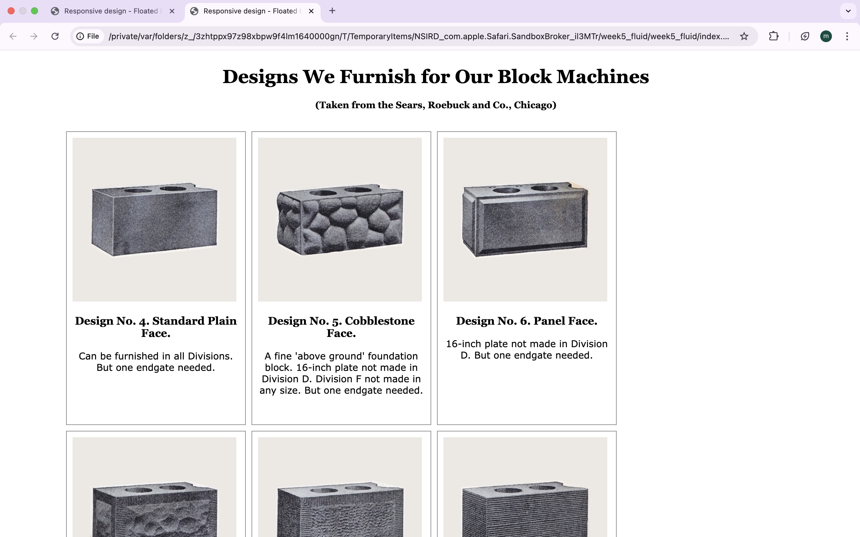
Before CSS modification
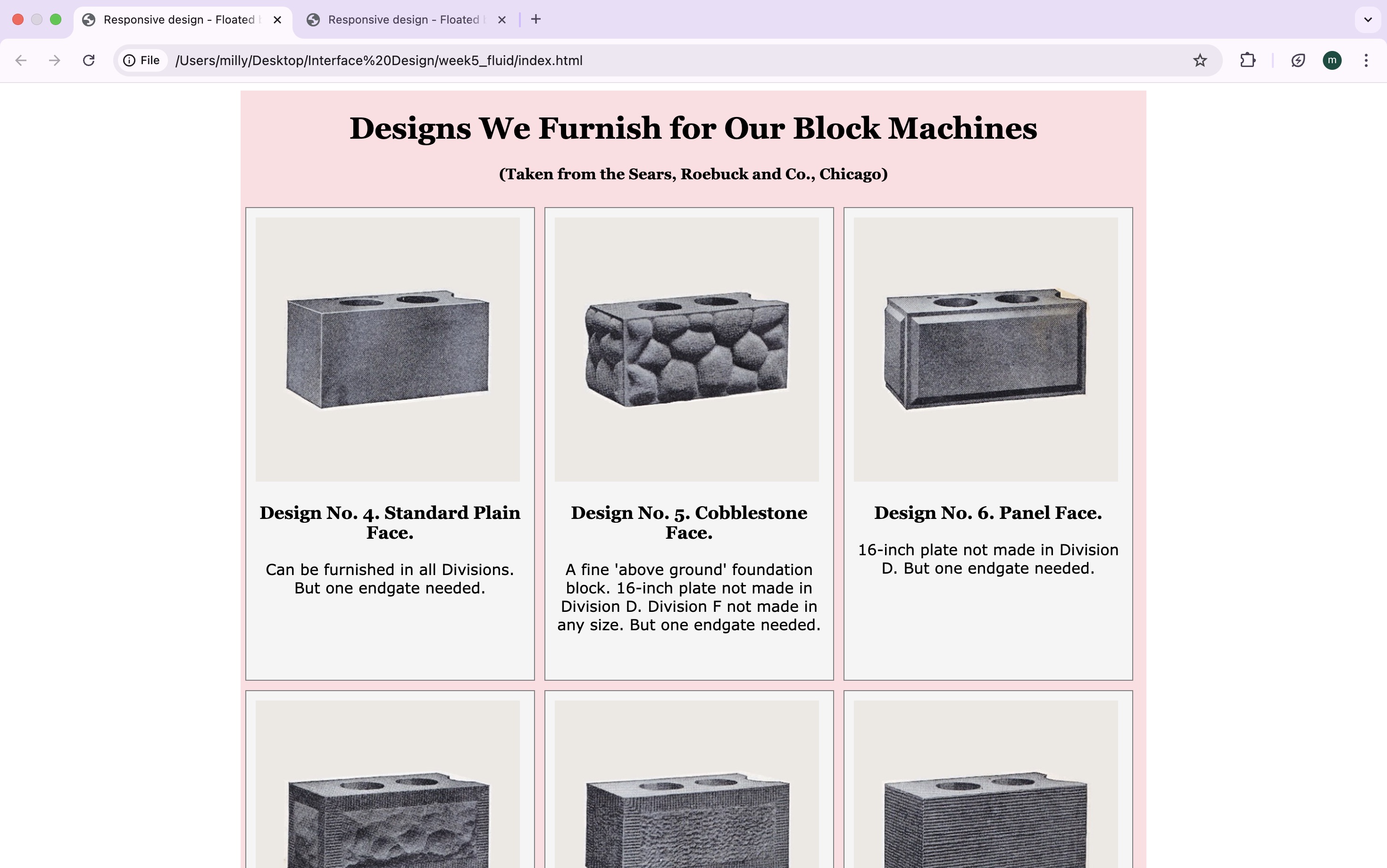
After CSS modification
Originally, the boxes were not centre aligned which I fixed by adjusting the width of the wrapper containing them to 960px. This also helped me better understand the 'float' CSS property and its function in a responsive web page.
960px
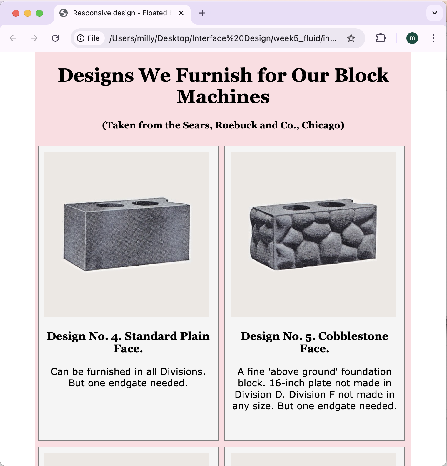
640px
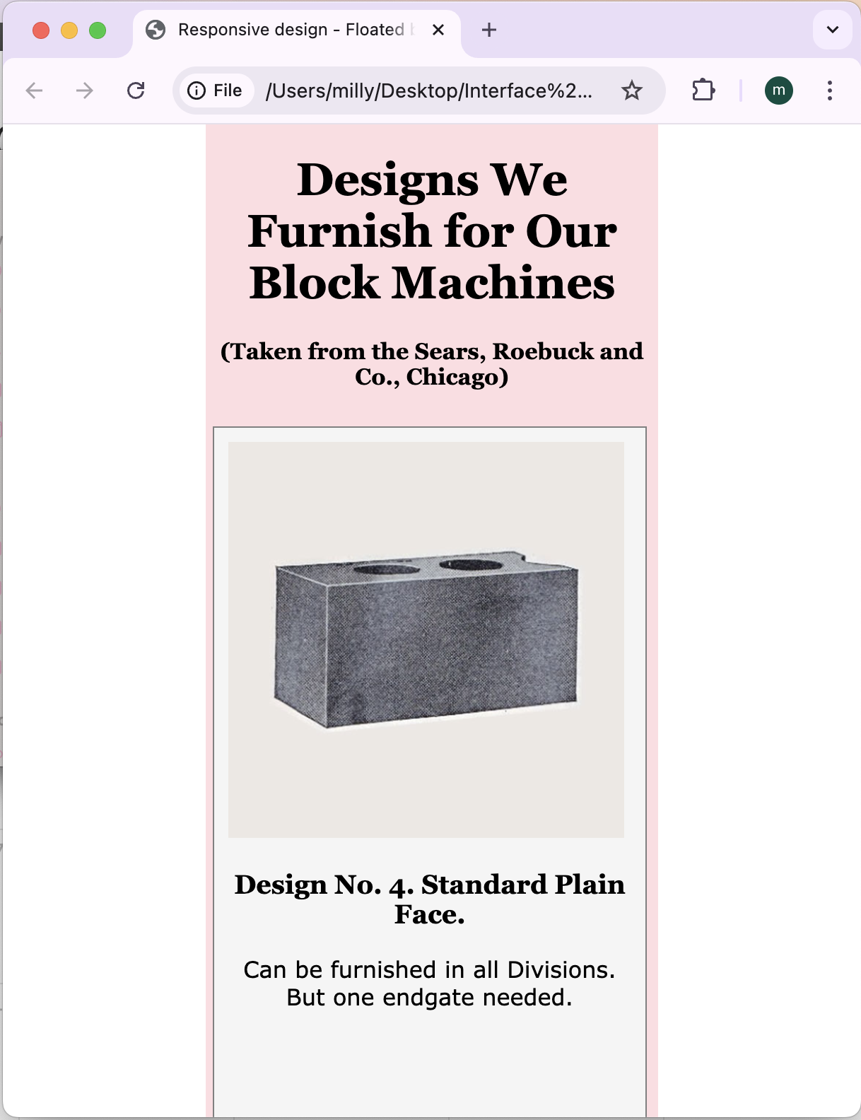
This is how the web page responds when the width is minimised - I achieved this by inserting media queries that specified the maximum width for multiple screen types, namely tablet (960px) and smartphone (640px), that created breakpoints for the content. Exploring responsive design has given me valuable insight and guidance for how I will adjust future websites so that they are appropriate for a wider range of devices!